
Case study
Tyton Holdings
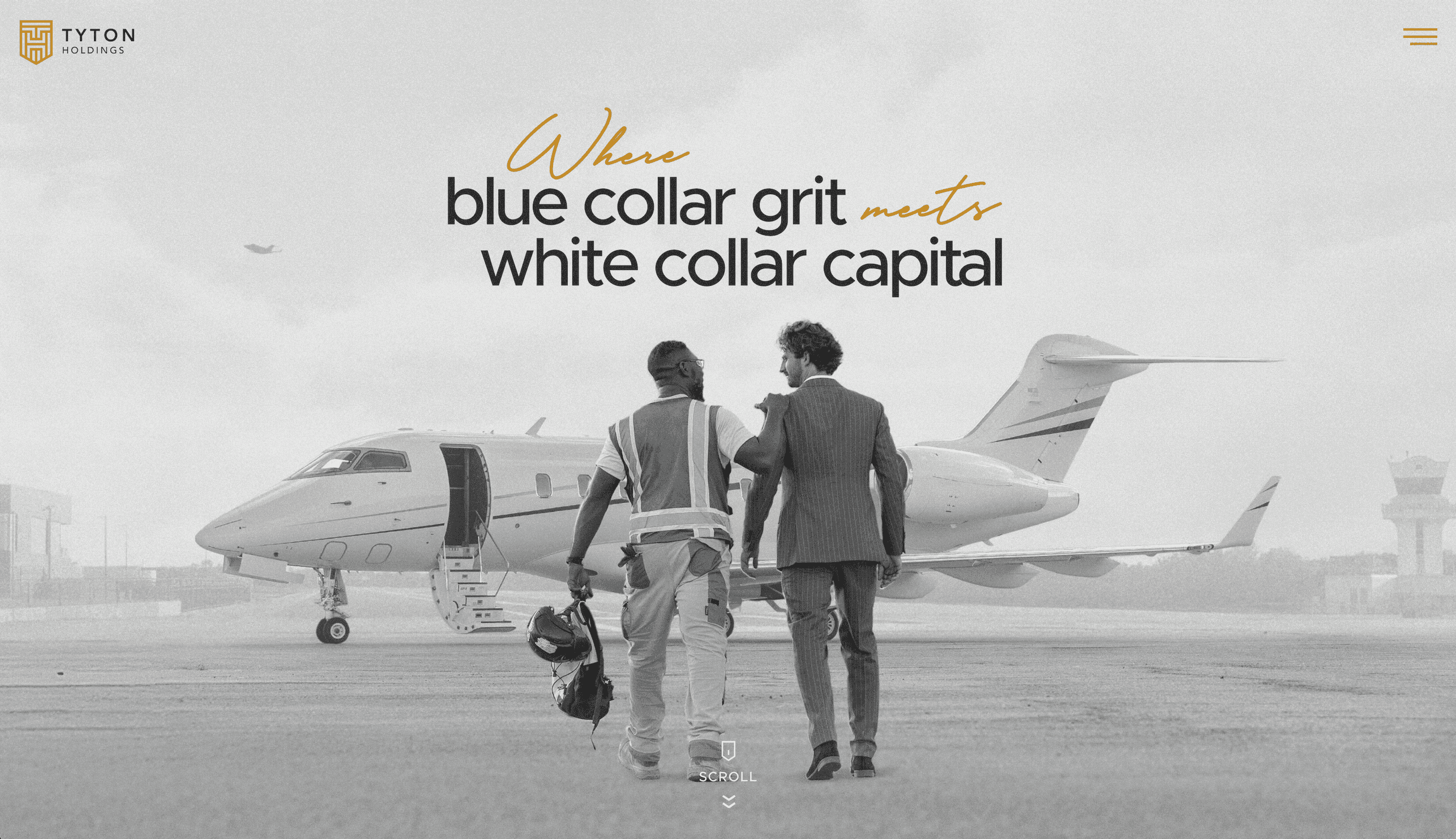
Where Blue-Collar Grit
Meets White-Collar Capital
Tyton Holdings isn't your typical private equity firm. They're a strategic family office. That means they're backed by independent capital (not outside investors), and bring their years of experience growing businesses to their investments in essential industries like energy and infrastructure.
Despite their success, Tyton was nearly invisible online. No website. No digital footprint. For a company built on reputation and relationships, that meant constantly re-explaining who they were to potential hires and partners.
SERVICES PROVIDED:
Branding & Design
Copywriting
Web Development
Video Production
Animation
Photography
CASE STUDY
No digital Footprint
As Tyton’s portfolio and reputation continued to grow, their lack of an online presence became a noticeable gap. They needed a way to tell their story clearly, reach the right people, and establish credibility from the very first impression.
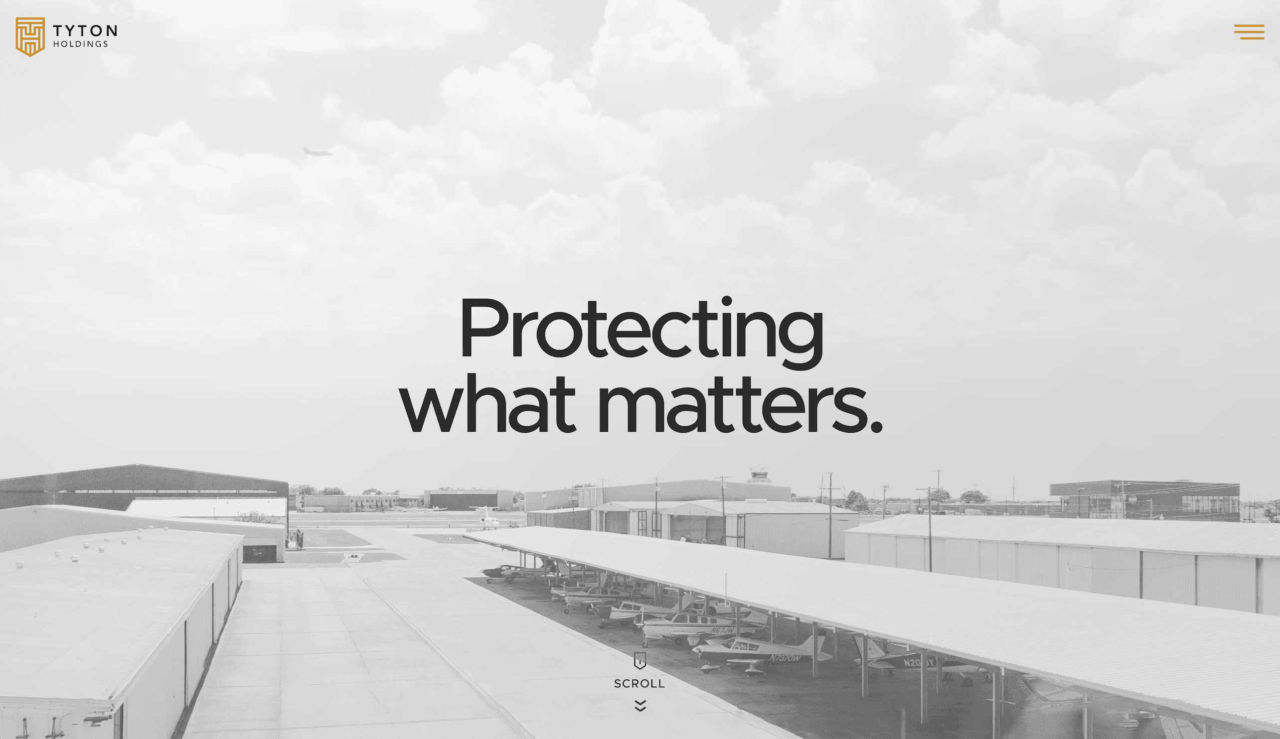
Tyton Holdings didn’t have a website, so when people searched for them online, they found almost nothing.
With no information online, every new hire, intern, and partner conversation started from scratch. This meant repeating the same information over and over again in every interview, costing valuable time.
Without a digital presence or clear design system, Tyton’s identity wasn’t keeping up with the caliber of the companies they were building and acquiring.
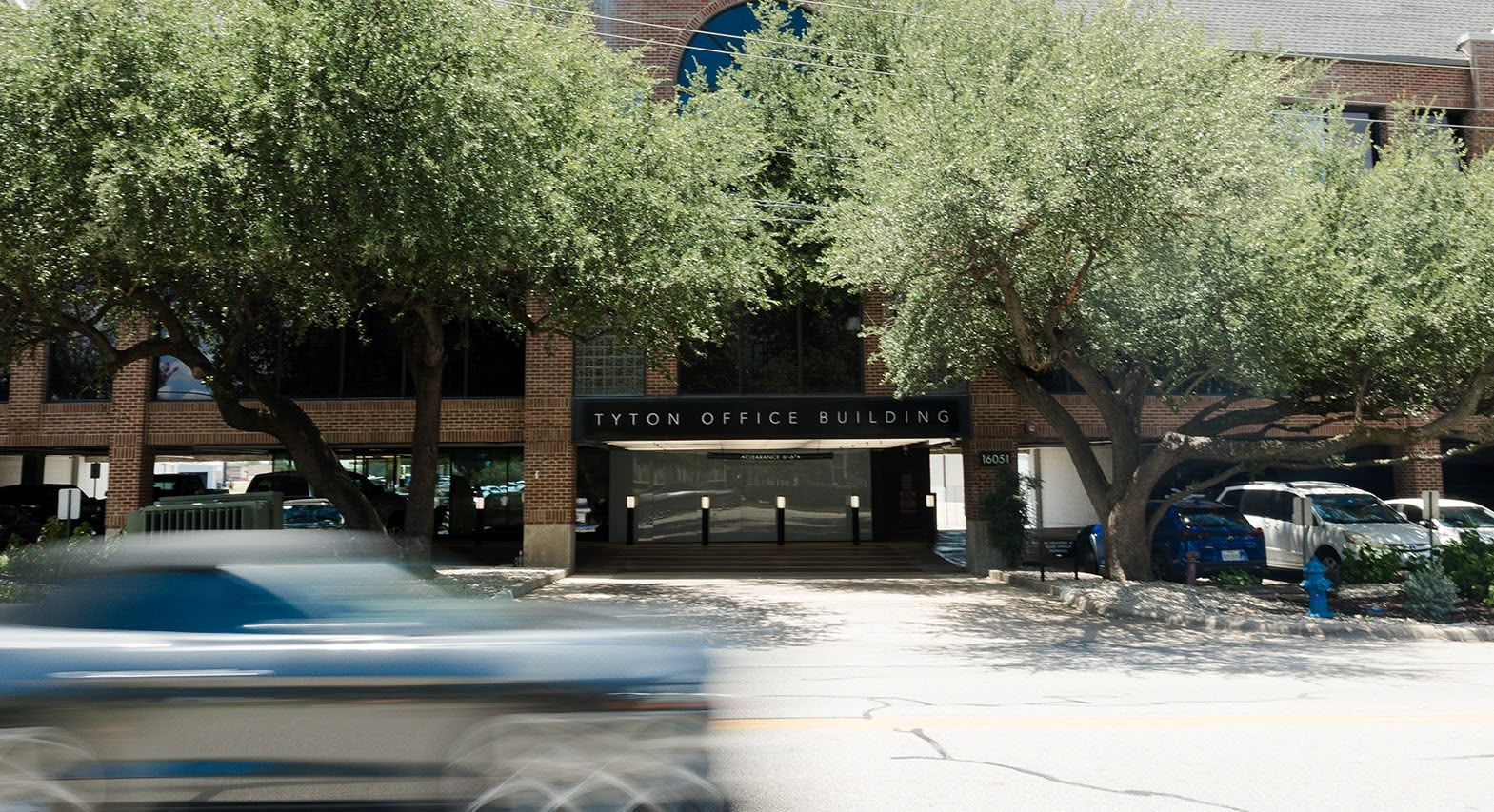
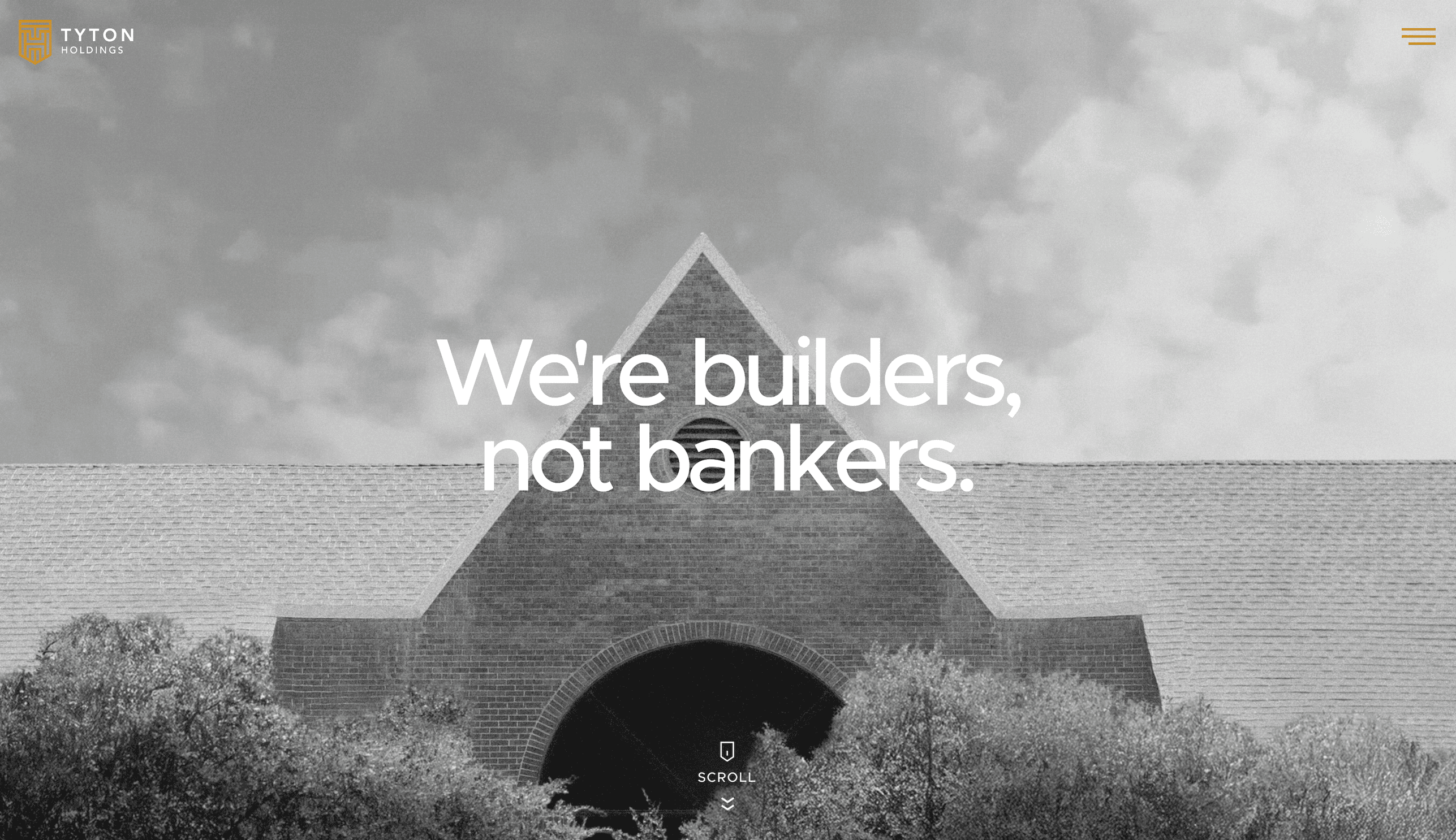
Fig. 01: The Tyton Office
Stand out from the crowd
There were a lot of things we wanted to accomplish with Tyton’s new website, but it ultimately came down to a few key goals:
Build trust and credibility.
Create a site that serves as a validation tool for who Tyton is - clearly communicating their mission, values, and what they stand for to potential partners and hires.
Stand out in a sea of sameness.
Design something completely original - not another templated, corporate-looking "trendy" site. The goal was to avoid the clichés of typical VC and private equity firms and instead build something bold, creative, and human.
Bring the brand to life through motion.
Develop a highly dynamic website experience full of movement, interactions, and engagement - a visual reflection of Tyton’s forward-thinking, tech-oriented approach.
digging deep
Our discovery process began with a series of in-depth conversations designed to unpack who Tyton is, what they stand for, and what truly sets them apart.
We worked closely with their leadership team to identify key brand themes, and out of that, we developed a comprehensive Brand Handbook: a visual and verbal foundation that distilled everything from their history and culture to their tone, competitive edge, and key audiences.
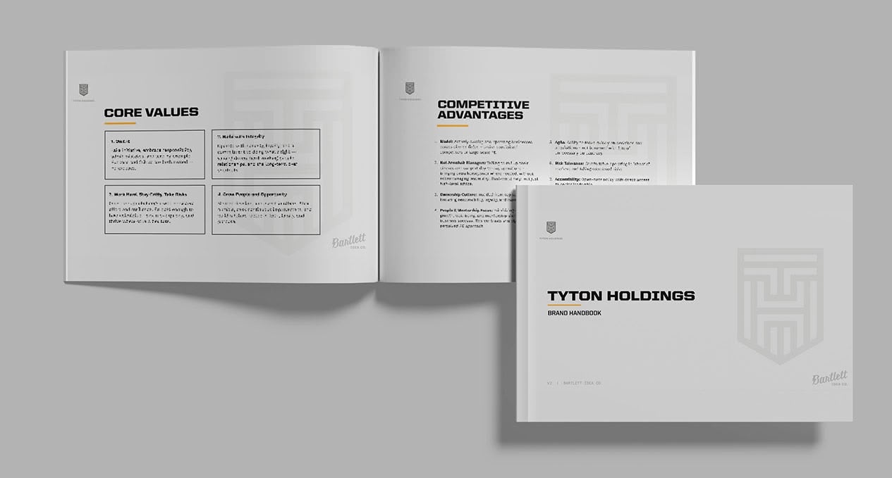
Fig. 02: The Tyton Brand Handbook
That document became the blueprint for everything that followed - ensuring that every visual, animation, and line of copy reflected Tyton’s hands-on, people-first, and legacy-driven spirit.
a. the written content
Copywriting
One of the most important (and often overlooked) aspects to a compelling website design? The copy.
Fig. 03: Copywriting magic
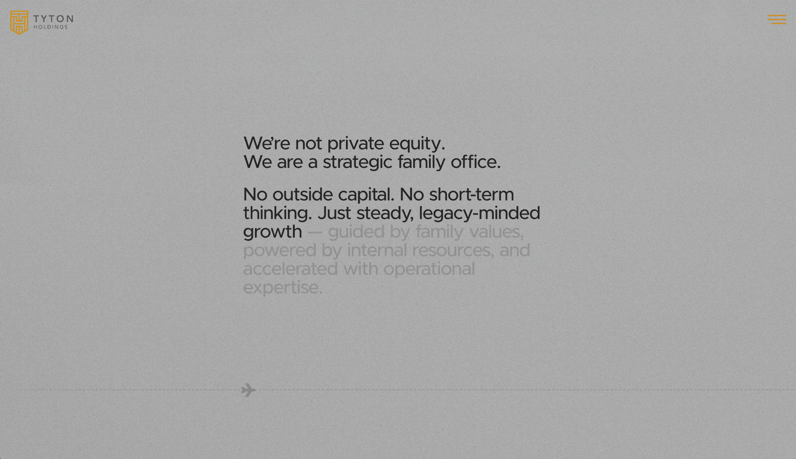
Based on the discovery work, we developed key messaging, hero statements, and supporting copy that captured Tyton’s distinct tone: bold, grounded, and human.
The result was messaging that feels authentic, confident, and unmistakably Tyton.

Fig. 04: Hero Copy Examples
b. The visuals
Photo/Video Content
Tyton already had a strong brand film, but the website needed a full library of supporting visuals to bring the story to life.
Fig. 05: Behind the scenes of the tyton content shoot
We organized a two-day content shoot at Tyton’s Texas headquarters to capture everything needed - team photos, headshots, office lifestyle imagery, and a series of creative hero shots that reflected Tyton’s bold, grounded energy.


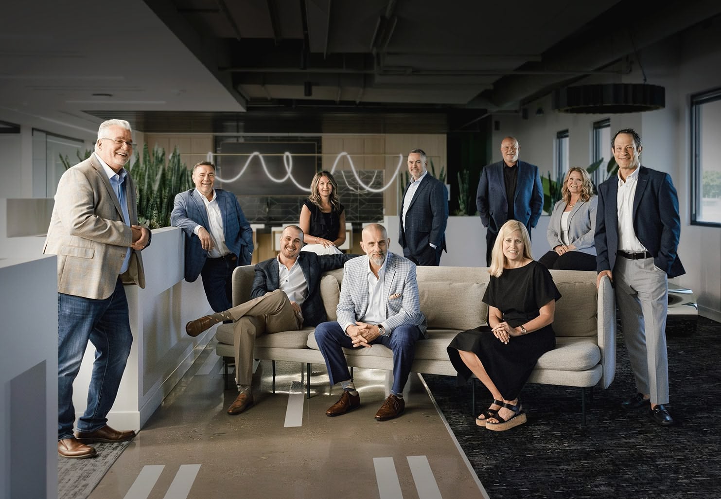
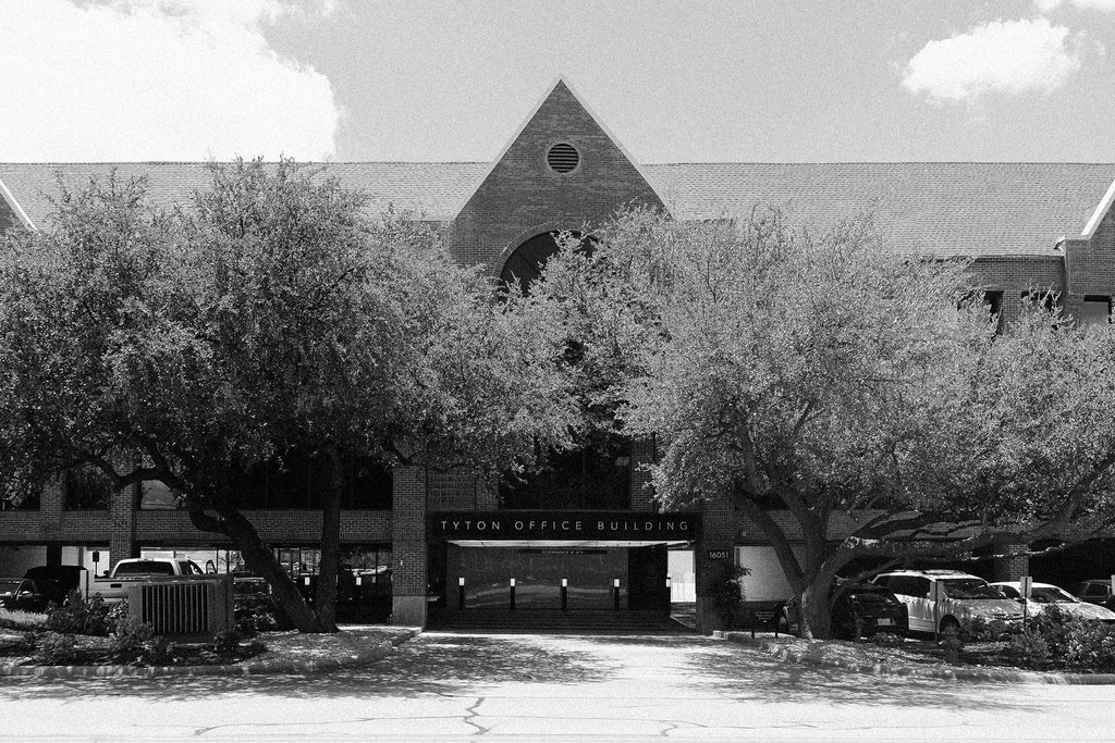

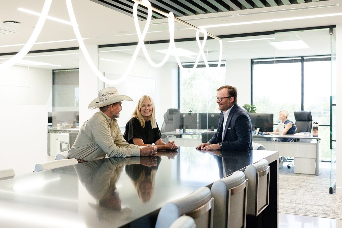
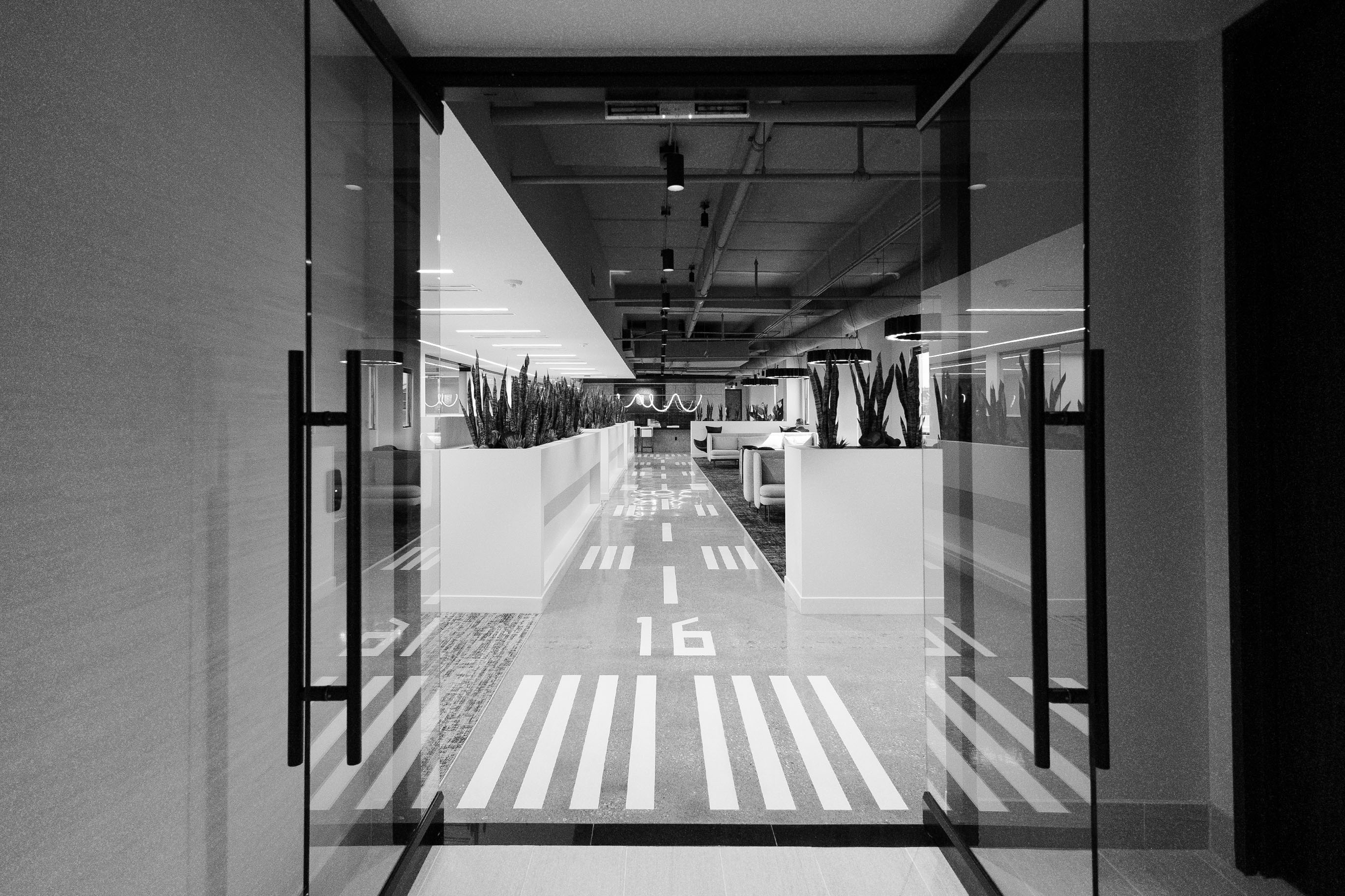
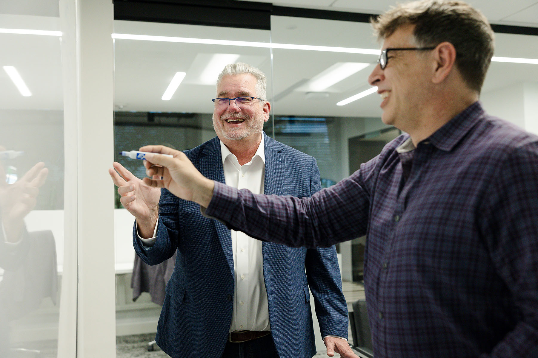
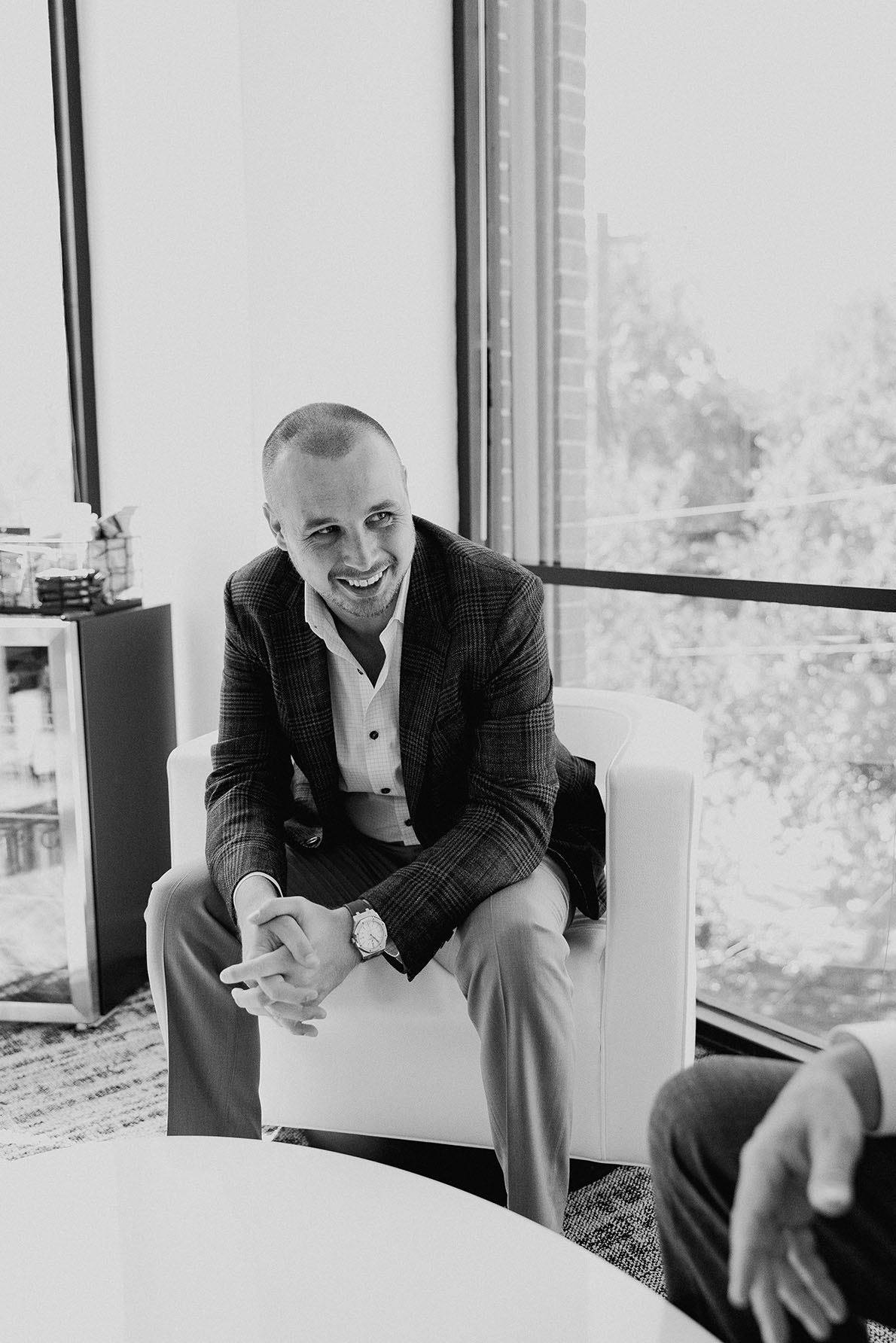
Fig. 6: Tyton Brand Photography
Alongside photography, we filmed over 20 short videos, including leadership introductions and team testimonials, giving the website an authentic, human voice. Every piece of content was planned with the site’s flow and tone in mind - ensuring the visuals worked hand-in-hand with the copy to tell a cohesive story.
Leadership Intros
Team Testimonials
A. Design Exploration
Sitescape
We started by creating a sitescape - a visual guide defining how Tyton’s brand would come to life online. This phase explored colors, typography, icon styles, and overall design direction - essentially a mood board for the digital experience.
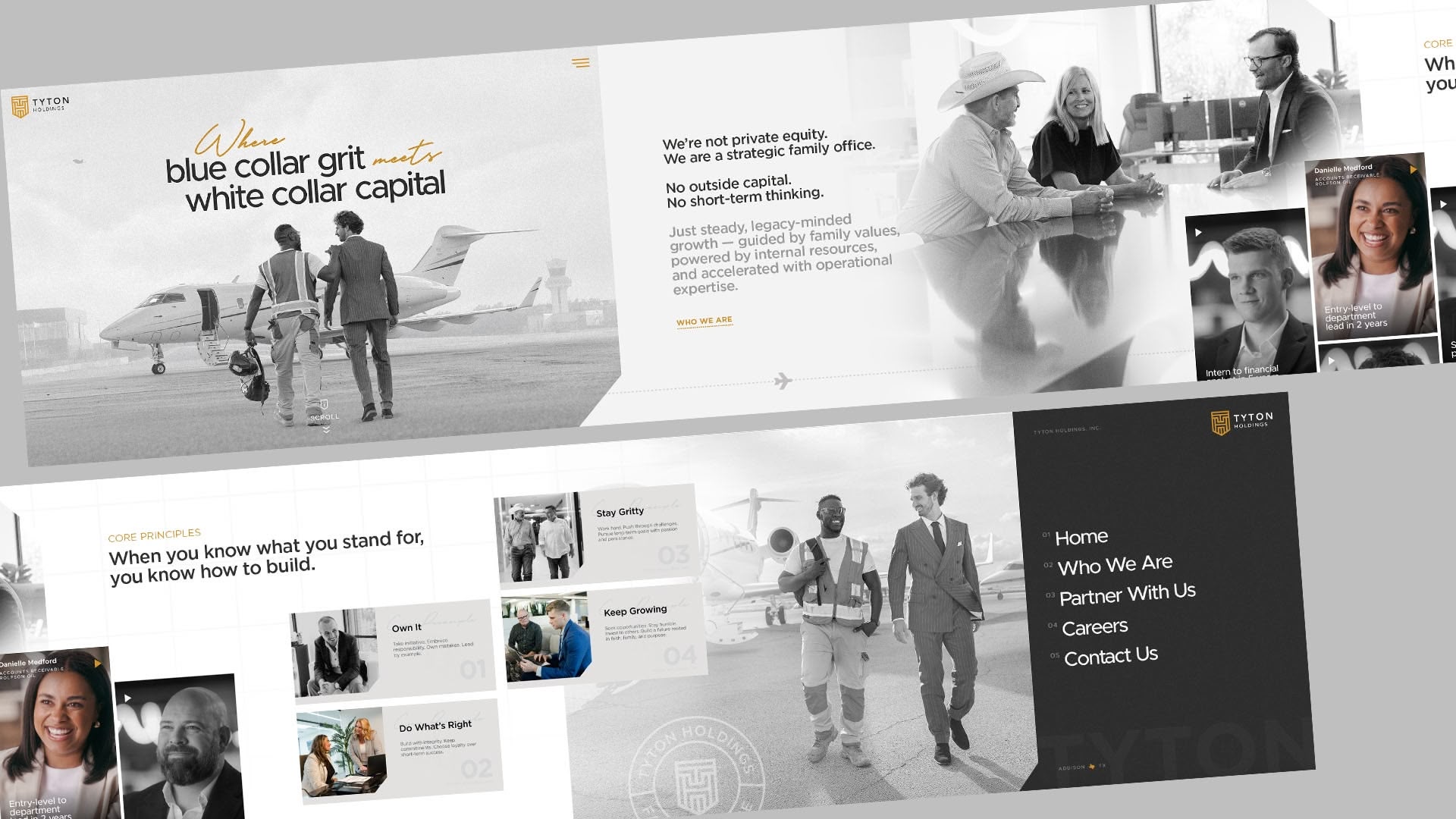
Fig. 07: The Tyton Sitescape
Fig. 08: Tyton Logo Refinement
Fig. 09: Additional Brand Elements
We leaned into a bold, filmic aesthetic - using black-and-white imagery with a subtle grain texture and cinematic contrast to create depth and emotion. Real photos of Tyton’s people took center stage, reinforcing authenticity and breaking away from the abstract, impersonal visuals so common in the private-equity space.
Fig. 10: Creating the hero image
B. Design Buildout
Page Mockups
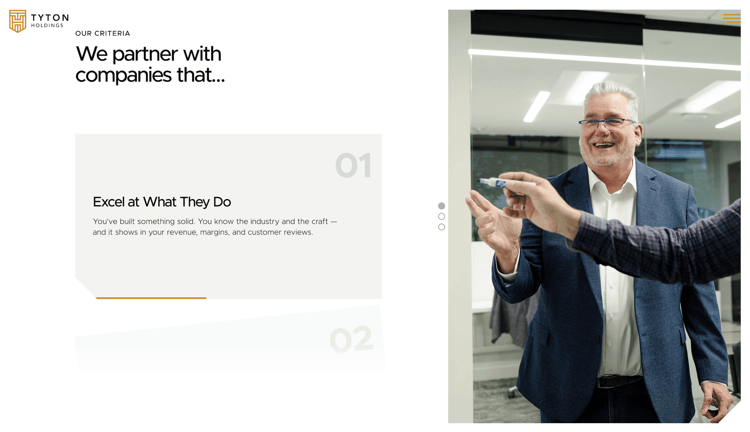
Once the direction was set, we moved into detailed mockups for every page of the site, refining the balance between blue-collar grit and white-collar polish. The goal: create something bold, grounded, and premium.
We designed purposeful interactions that made the site feel alive without ever getting in the user’s way. Every scroll, reveal, and transition was crafted to make information more digestible and the experience more memorable.
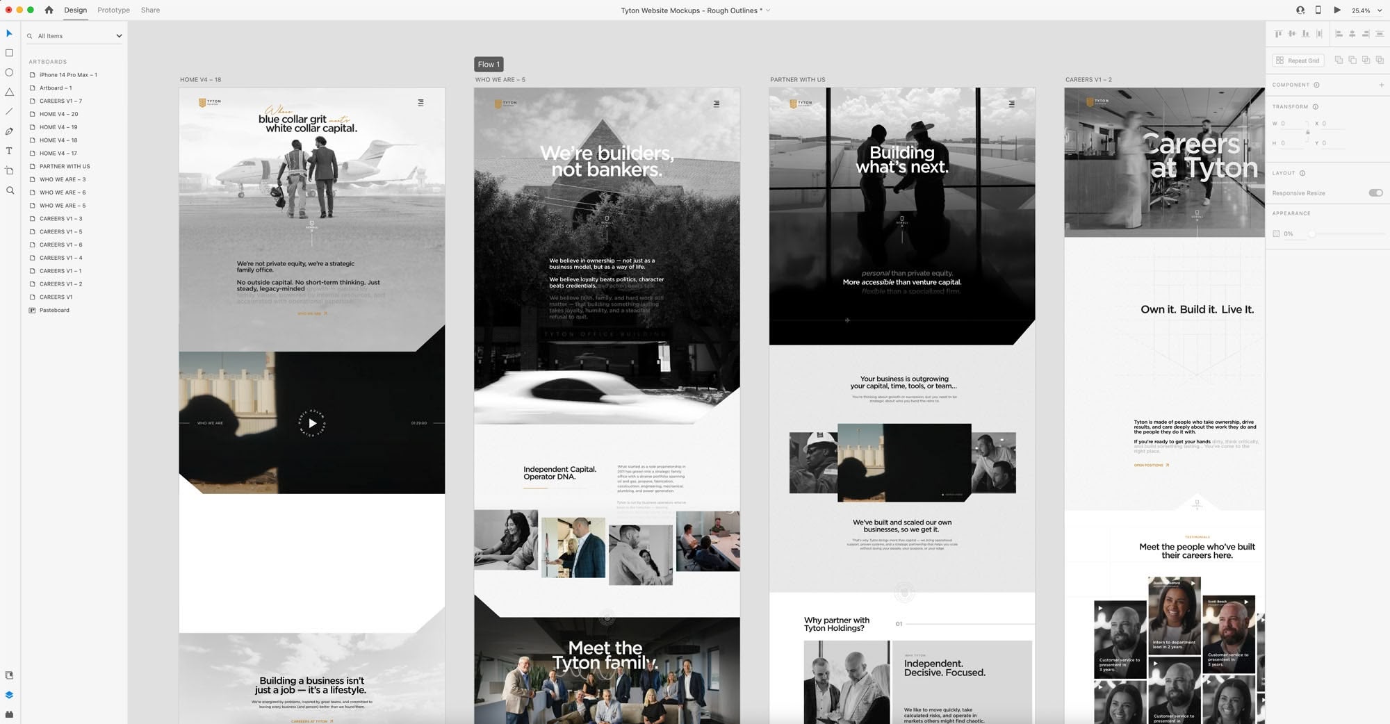
Fig. 11: Tyton Website Page Mockups
a. Development & Testing
Design Meets Deployment
We built the Tyton site on Framer, chosen for its speed, flexibility, and ability to bring complex animations to life through the React framework.
Fig. 12: Tyton Website Development & testing
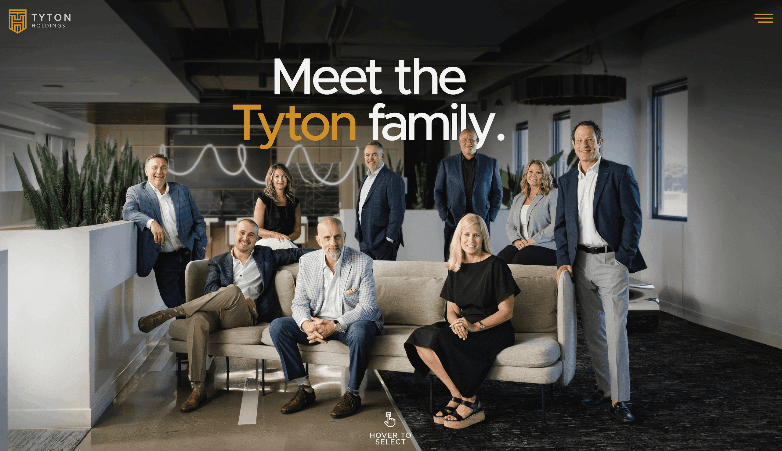
Some sections required extra creativity, like the interactive “Meet the Family” section, where users can click on individuals in a team photo to learn more about them.
Fig. 13: Tyton Website Team Section
We made sure to optimize layouts, animations, and load times to ensure the experience felt seamless on any device. The result is a site that’s fast, dynamic, and built to last.
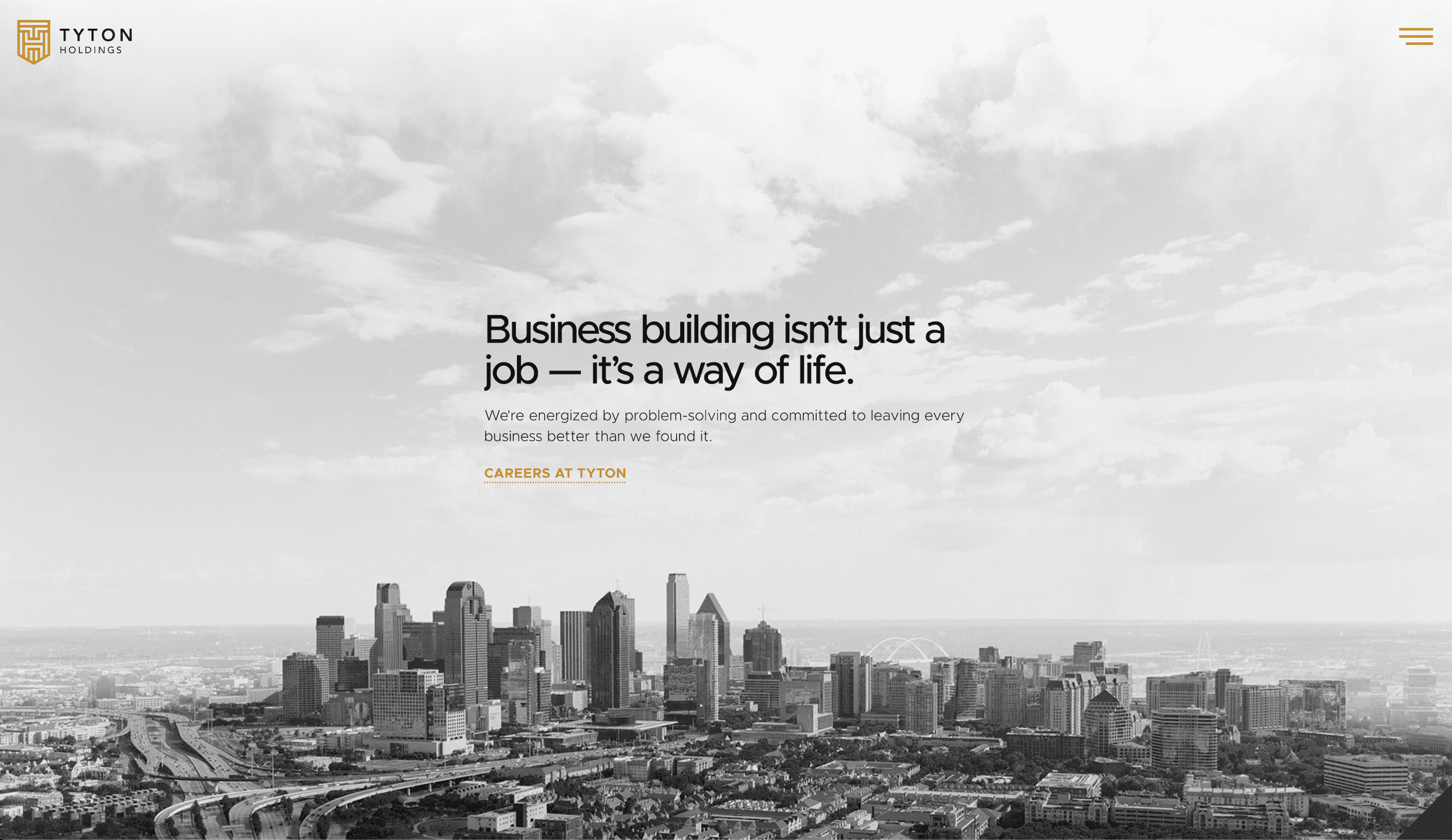
Fig. 14: Tyton Website about page
Fig. 15: Tyton Website Partner Page
Mission accomplished
Tyton was thrilled with the final result - a site that finally captures who they are and what makes them special. Since launch, the feedback from across industries has been incredible.
We’re proud of how this project brought Tyton’s story to life and are excited to see the site continue serving their team, partners, and future acquisitions for years to come.
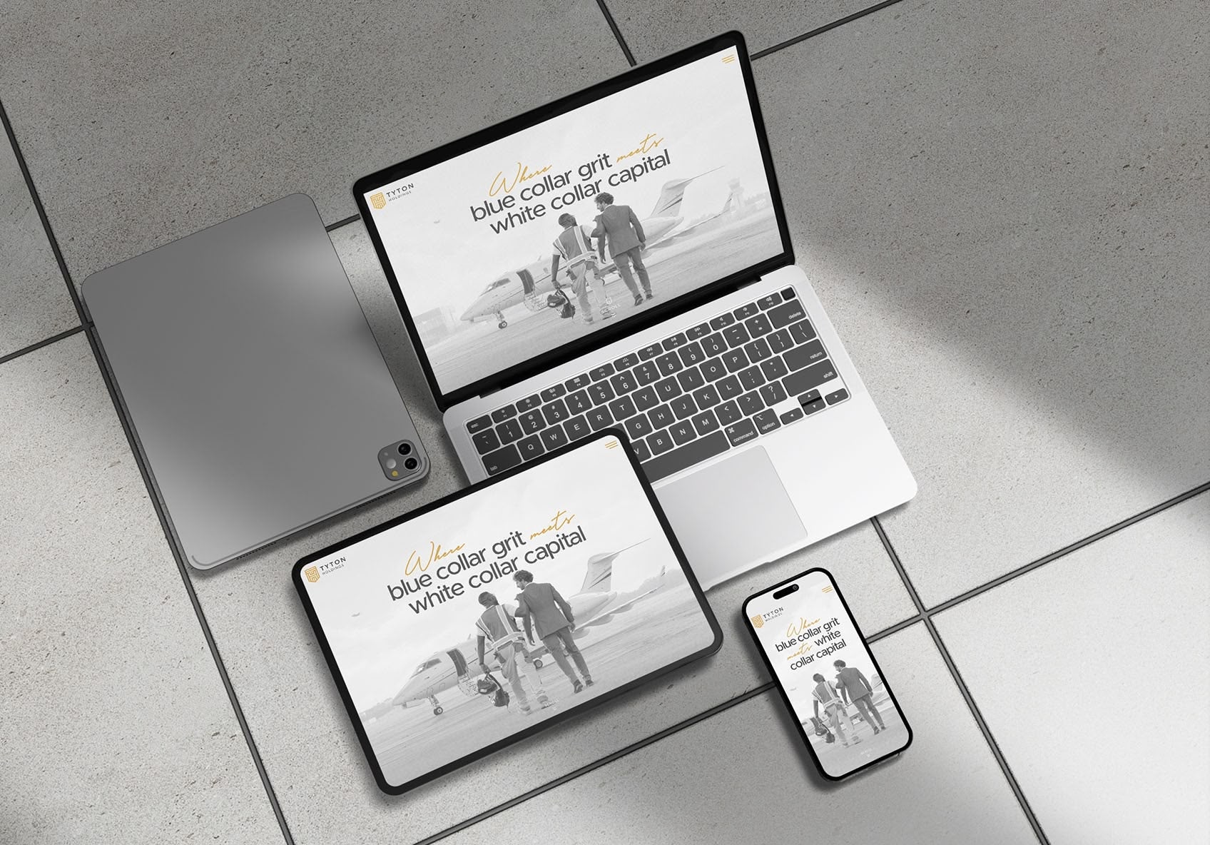
Fig. 16: Completed Tyton Website
Credits
Project Manager:
Timothy Schutz
Creative Director/Designer:
Copywriters:
Sarah Klongerbo,
Andrew Bartlett
Framer Developer:
Josh Feland
React Developer:
James Schulze
Animator:
Photographer:
Abigail Thomsen
Video Producer:
Micah Versemann
VIDEO TEAM:
Hunter Starnes,
JOEY NICOTRA,
Caleb Jones,
Landon Starnes
Contact